Despite how crucial landing pages are to commerce today, you probably still find yourself scratching your head when you have to create one. You may even be surprised to learn the most effective landing pages follow several best practices.
To help you cut through the noise, here are our top 3 tips for creating high-converting landing pages.
- Design your landing page with modern and effective elements.
- Create a focused layout that flows smoothly for visitors.
- Include a specific– and irresistible– CTA.
Design your landing page with modern and effective elements.
Today, landing pages exist for offers of all sizes and price tags. But the key components of a good landing page aren’t industry-specific. You need to strike a balance between listening to the experts and setting yourself apart from the competition.
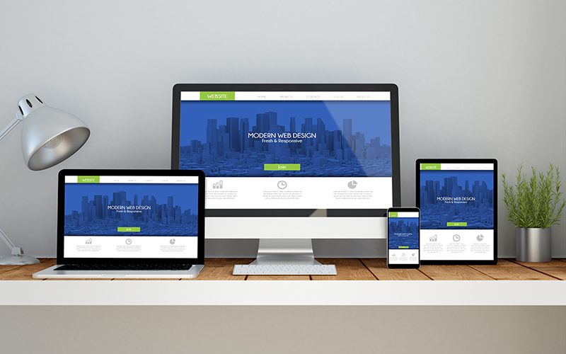
The design of your landing page is the best way to find the perfect balance. For example, every landing page has an image to break up the text. But what if you took that a step further? Videos, images with interactive sliders, and GIFs are all unique ways to break up a landing page.
Adding rich media to landing pages may eventually become the norm. But right now, it’s an easy way to set yourself apart. But don’t overdo it– two videos would be too many, for example.
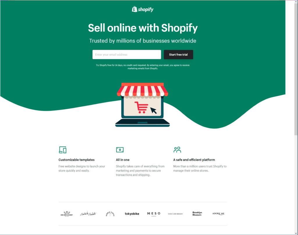
Finally, test your landing page to ensure your content appears above the fold. Today, “above the fold” means the part of the web page a visitor can see without scrolling. Ideally, your entire landing page should be above the fold.
Shopify’s landing page is a great example. It’s extremely focused, and the most relevant content is above the fold. If you can achieve this, your visitors will be far less likely to abandon your landing page.
Create a focused layout that flows smoothly for visitors.
Over the years, experts in web development services have isolated the structure of the most effective landing pages. Today, this structure is still known to be the highest-converting.
Start with a strong headline at the top of the page. Below, add a short, benefit-driven description of your offer. This should be a maximum length of a few short paragraphs. Don’t forget a relevant image of your offer or its benefits.
It’s important to remove website navigation from landing pages whenever possible. Links to other pages means your visitors have an easy way to abandon the page. This may seem like a small detail, but it’s necessary for all high-converting landing pages.
Social proof is extremely important too. Use testimonials, logos of companies who’ve bought this offer, or even badges showing secure payment submission. Dispel any doubts your visitors may have.
The most important element is the form where you ask for your visitor’s name, contact info, and billing info if relevant (called the lead capture form). It’s important to have this form on the landing page, instead of on a second page.
Why? Because a hidden form is a red flag for visitors. They’ll assume your form is invasive to their privacy.
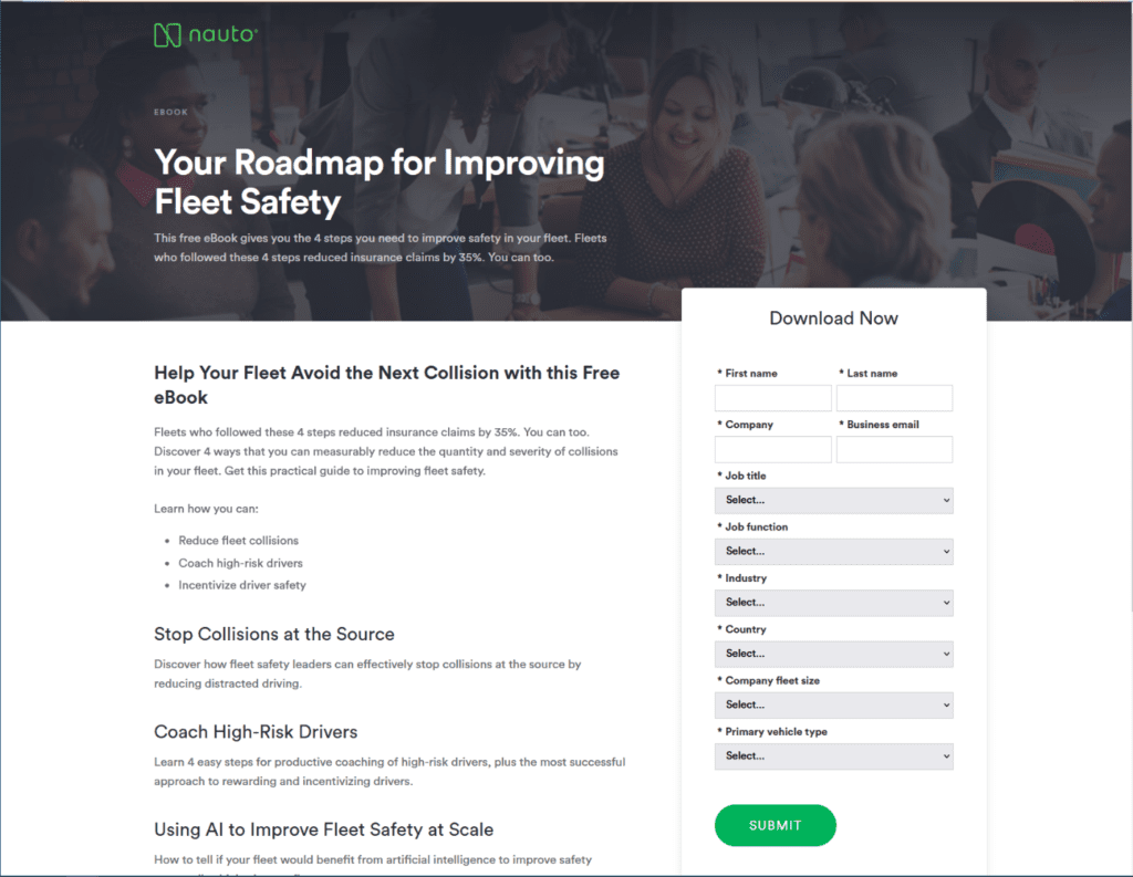
Nauto’s landing page for a new e-book has a good layout. If more of the page content was above the fold, this landing page would be the gold standard!
By following this proven, hyper-focused layout, you’ll minimize the number of visitors who leave your landing page without filling out your lead capture form.
Include a specific– and irresistible– CTA.
Your CTA, or call-to-action, is the action you want visitors to take. This could be joining an email newsletter list, signing up for a product demo, or even buying a product.
Whatever the action is, your CTA must be compelling. A weak CTA means people will leave the page without doing anything… and that’s the worst-case scenario for any landing page.
The most important elements of your CTA are clarity and irresistibility. Being clear is straightforward– you just have to be honest. Don’t promise a free trial just to surprise your visitors with a mandatory purchase, for example.
Being clear also means you don’t overpromise. Visitors will get confused about what you’re offering if your CTA mentions one offer while your headline focuses on another. Be honest, focused, and consistent in every CTA.
Crafting an irresistible CTA is tricky if you don’t know your audience. Having a clearly defined buyer persona when you create landing pages is crucial. If you outsource your web development services, they can provide you with one. You can easily create buyer personas internally, too.
Consider your buyer persona, and imagine them asking you “So what? What’s in it for me?” Really think about what benefit they’re getting, and what they value most. You’ll have a powerful CTA in no time.
Measuring the Success of Your Landing Page
Creating an effective landing page is only half of the story. Whether you’ve hired out your web development services, or you handle metrics internally, you can use similar KPIs.
Over the course of your campaign, track your landing page’s conversion rate, bounce rates, and average time spent on the landing page. There are other factors you can consider if you so choose, but these 3 metrics will give you a high-level overview.
If you record data for multiple landing pages, over time you’ll discover what your audience responds well to… and what they don’t. If one landing page does particularly well, you can make it your “control” to compare future landing pages against.
Landing pages can serve a wide variety of purposes, from getting blog subscribers to selling a new product. Once you’ve mastered our tips, you too will be utilizing landing pages to their fullest potential.